
Ed
World Food Programme Inspire 2023 award

Redesigning Farm2Go, the app connecting smallholder farmers to traders.

Native Android UX research Information architecture Prototyping UI design Design system
Client
World Food Programme (UN)
Sector
Humanitarian · AgriTech
Pilot
Bangladesh
Timeline
8 weeks · release Jan 2023
Platform
Native Android
My role
Product designer & team lead
Team
UX researcher, product manager, front- & back-end developers
Goal of the collaboration

Redesign the UX and UI of Farm2Go, test new features with end-users, and create a scalable design system for a native Android app that connects farmers and traders in developing countries.

In a rush? What we achieved
  • Redefined and validated the high-level concept
  • Designed two new features: payment tracking and direct offers
  • Tested the flows with stakeholders working with farmers in the field
  • Created a new visual direction aligned with WFP’s guidelines
  • Built a design system ready to scale, and delivered pixel-perfect screens
01 — Context

An app that worked on paper, but wasn’t ready to ship

When we joined, the WFP team already had a test flight of the app but had not managed to release it. Some features were missing, others had never been tested with users, and the look & feel needed to feel modern and appealing.

Farm2Go connects smallholder farmers, middlemen and traders: farmers log deposits of their crops, and traders buy through market offers.
02 — My role

Leading the design team

As team lead, I built the timeline, identified blockers early and made sure everyone knew what they had to deliver. I kept communication smooth between our team, the product owner and developers, with a close eye on deadlines and deliverables.

03 — Research

Forgetting e-commerce patterns

We started with a heuristic review of the existing product, then spent three days with stakeholders from Bangladesh, where the first pilot would run — people in daily contact with the end users.

The insight that changed everything: common e-commerce patterns and automation simply did not apply in the field. Agreements change at the moment of the trade, so the tool had to be flexible for field users while staying reliable enough for WFP to track activity — data later used to grant loans to farmers.

“They might agree to a certain quantity or price, but when they meet to trade the goods, they end up agreeing on a different quantity.”
04 — Process

One feature concept a day

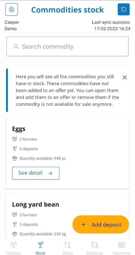
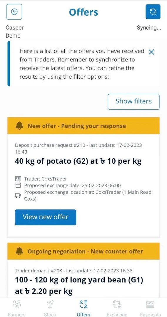
To align fast, I designed one complete feature concept per day and reviewed it with the product owner in a one-hour stand-up. This let us iterate quickly and have a prototype ready to test by week two, covering the redesigned features and the new payment and direct-offer flows.

We then ran two rounds of five test sessions, iterating between each, to make sure the product was intuitive and the new features obvious. In parallel, I created a new look & feel consistent with WFP’s visual guidelines and a design system of foundations and components that sped up front-end development.

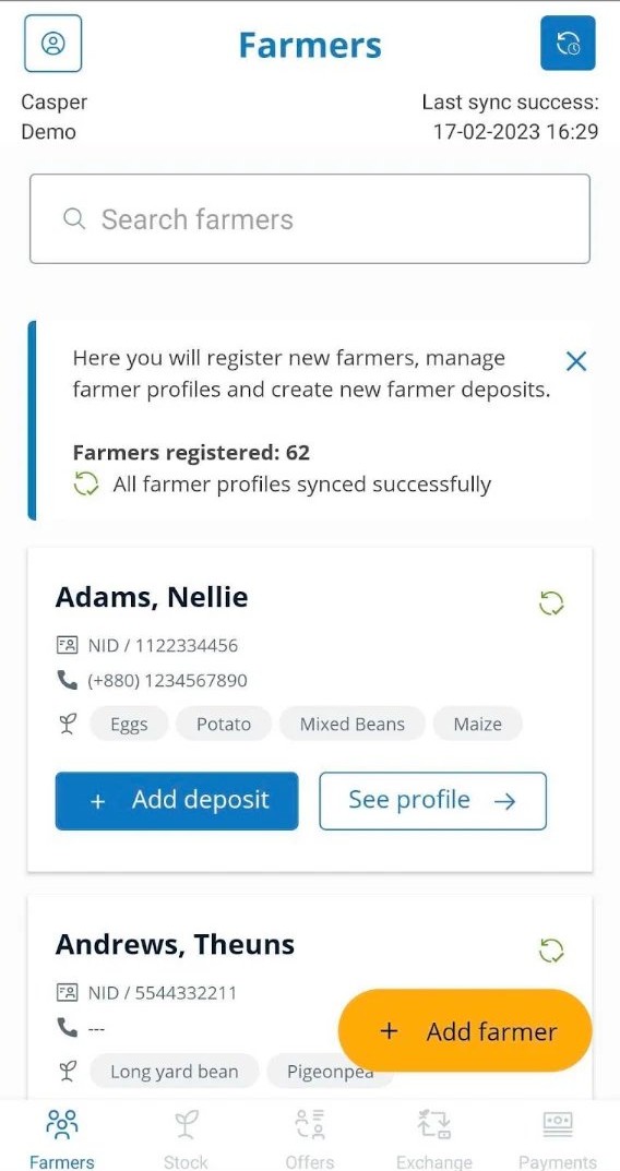
Farmers list with deposits and add-farmer action
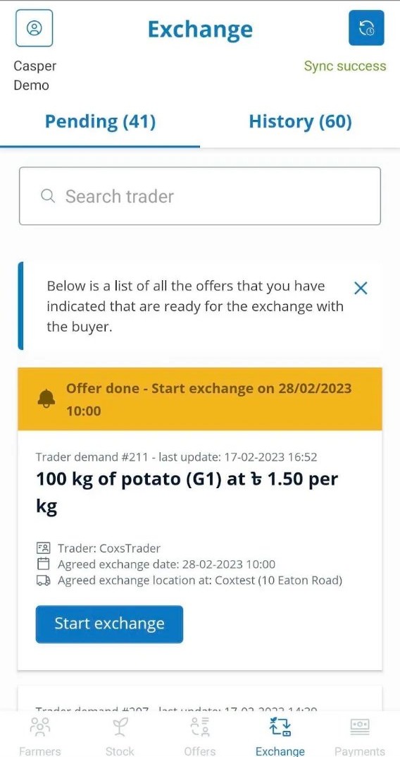
Exchange screen with pending trades
From farmer to trade

Built for the field: every farmer and their crops one tap away, and every agreed trade tracked through to the exchange.

My contribution

  • UX review of the current app and its information architecture
  • Interviews with primary stakeholders
  • Journey mapping for the two new features
  • Fast iterative sketching and wireframing sessions to align on the solution
  • User tests with the UX researcher to validate the flows
  • A new visual direction, keeping the WFP design guidelines in mind

Outcome

  • Two new features integrated: payment and direct offers
  • Foundations of a design system, ready to scale, for consistency and faster implementation
  • Pixel-perfect UI screens and documentation delivered, with a release in January 2023
  • Key UX metrics defined to monitor: task success rate and time-on-task

Challenges & takeaways

01

Joining an ongoing project

We had to get up to speed fast to bring value without wasting the team’s time — while still challenging their assumptions with facts.

02

Admitting that patterns sometimes don’t work

Many features looked like familiar e-commerce flows. The realities of the field made us leave those patterns in the drawer and craft a tailor-made experience.

03

Bringing simplicity to complexity

Simple on the surface, complex underneath. Combining the team’s experience with an out-of-the-box approach, we found solutions that handled the complexity and tested them to make sure they stayed intuitive.

Next case study Lantum Template Manager